

Trendlyne
Stock Overview
- 32.1%
- Drop Rate Before
- 8.4%
- Drop Rate After
- 400K+
- Daily Active Users
Role / Duration
Lead Product Designer /3 Weeks
Team
2 Front-End Engineer, 2 BackendEngineer & Myself

Overview
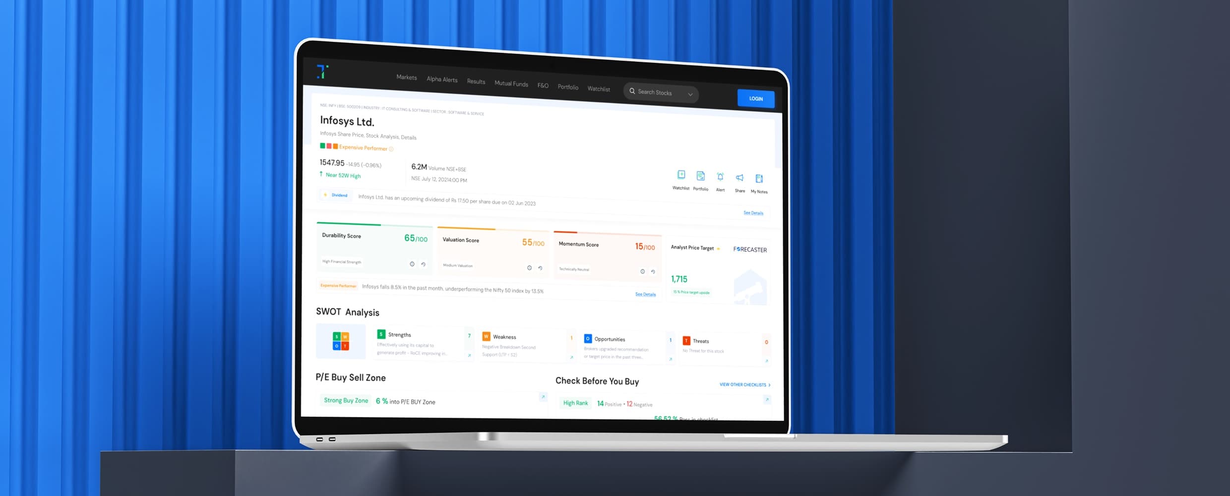
Trendlyne is a stock market analysis platform in India which also supports global stocks and Indian stocks analysis and reports. In the dynamic world of finance, a well-crafted Stock Overview page is indispensable for investors. By consolidating crucial metrics it empowers users to make swift, informed decisions. But, dense data, misaligned hierarchy, and zero personalisation were causing users to leave before making a single decision. We upgraded the stock overview experience by dividing the attention span equally and making the data digestible.





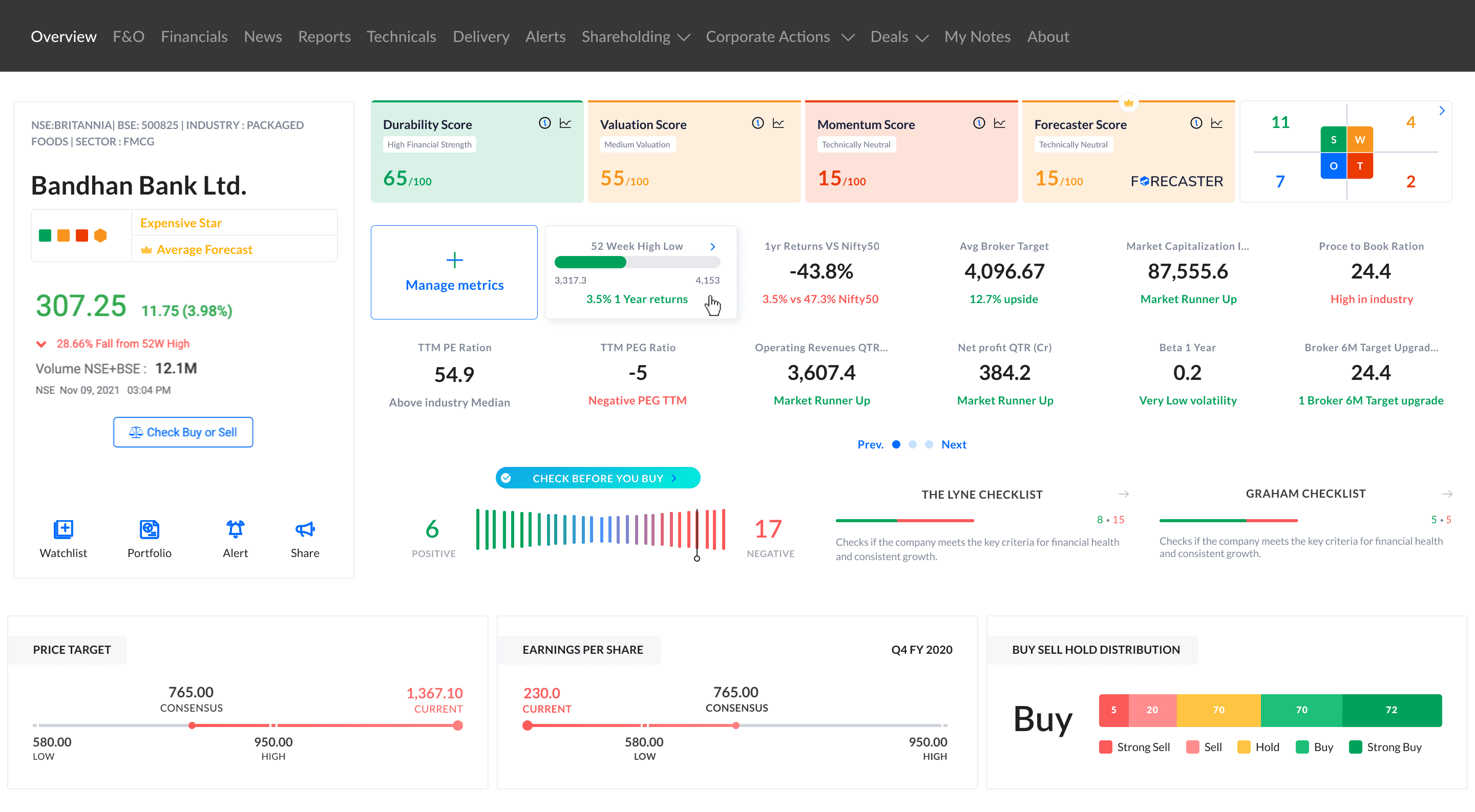
Old Design Fig
- These options are not properly noticeable at a glance
- The butterfly chart is hard to read for 80% of users
- These are very overwhelming for users due to strong colors
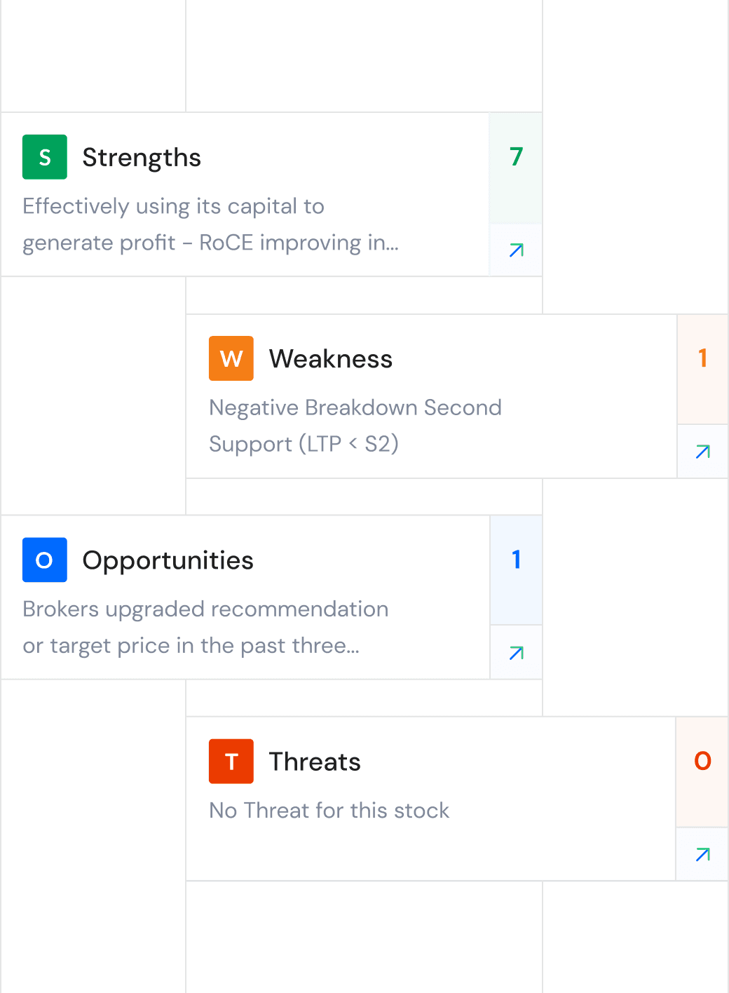
- New users are unable to understand what SWOT means
- The representation of numbers is very crowded
- These checklist is crucial to user but the design is not prioritising it

The Problem
The Stock Overview page was the most visited screen in Trendlyne, yet it had the highest drop rate (32%). Users couldn’t decode complex data fast enough to act, directly impacting user retention and engagement.
The real challenge? How do we show detailed financial info in a way that’s easy to understand and act on, without losing out on depth or accuracy?
Discovery
To ground the redesign in real behavior, I analyzed four months of usage data and ran 12 one-on-one interviews with both active and first-time investors. This uncovered two distinct user mindsets that shaped the decisions that followed.
Explorers (58% Users)
They are new to trading and navigate financial data with curiosity but limited confidence. They rely on educational cues, contextual explanations, and clear visual indicators to build understanding.
Their biggest struggle: interpreting jargon-heavy metrics and reading complex visualizations like the SWOT and butterfly charts.
Trailblazers (42% Users)
This group is experienced and fast-paced, they perform multiple trades daily demanding precision and speed. They focus on comparative analysis, trend tracking, and advanced metrics, often multitasking across screens. Quick numbers help them to make decision quickly.
Their biggest need: surface the right data first with minimum clicks and friction.
Pain Points
- 1

Users spent unnecessary effort scanning dense layouts to locate key metrics. The lack of hierarchy created cognitive load, hurting decision speed on a page where seconds matter.
- 2

A fixed structure didn’t reflect different user goals. Beginners needed guidance; advanced traders needed quick access to specific indicators. The static layout made the experience feel rigid and inefficient.
- 3

82% of users struggled with terms like SWOT and checklist metrics. Without embedded explanations or intuitive patterns, users dropped off early due to confusion and lack of trust.

Definition & Exploration
Filtered all the information from the different research streams and defined our product and business goals to the project. This acted as a north star for the design and development process. Planned to revisit components and prioritise those with higher interaction rate, ensuring that it remains familiar, simple and understandable. Before jumping to any low-fidelity wireframes, sketched out few initial ideas and evaluate them based on their pros and cons.
Business Goal
Attract a wider customer base and retain existing clients.
Increase platform adoption and user engagement.
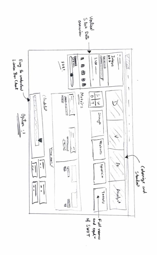
Pros 👍🏻
- Detailed SWOT components with designated spaces offer clarity to users.
- Easy to read & understandable linear chart instead of butterfly chart.
Cons 👎🏻
- Vertical stock data looks consisted.
- Need to spend time finding buy sell zone.
- Metrics list still looks busy.
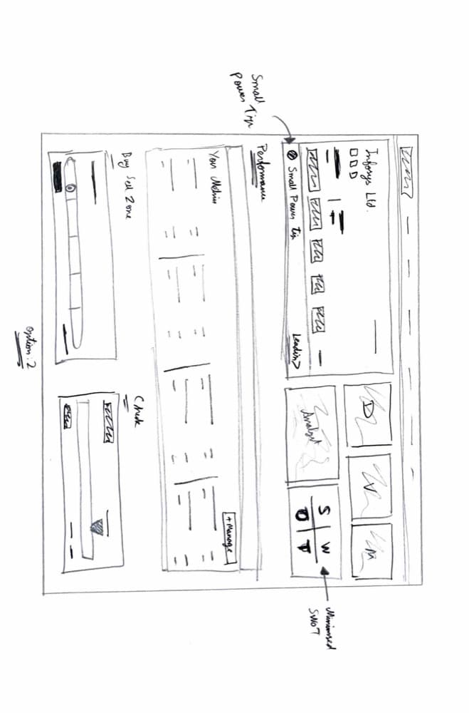
Pros 👍🏻
- Small power tip section and horizontal stock overview data.
- Customised metrics strip.
- Strong & readable buy sell zone.
Cons 👎🏻
- Smaller SWOT section.
- DVM looks very consisted.
Pros 👍🏻
- Detailed SWOT components with designated spaces offer clarity to users.
- Easy to read & understandable linear chart instead of butterfly chart.
Cons 👎🏻
- Vertical stock data looks consisted.
- Need to spend time finding buy sell zone.
- Metrics list still looks busy.

Validation
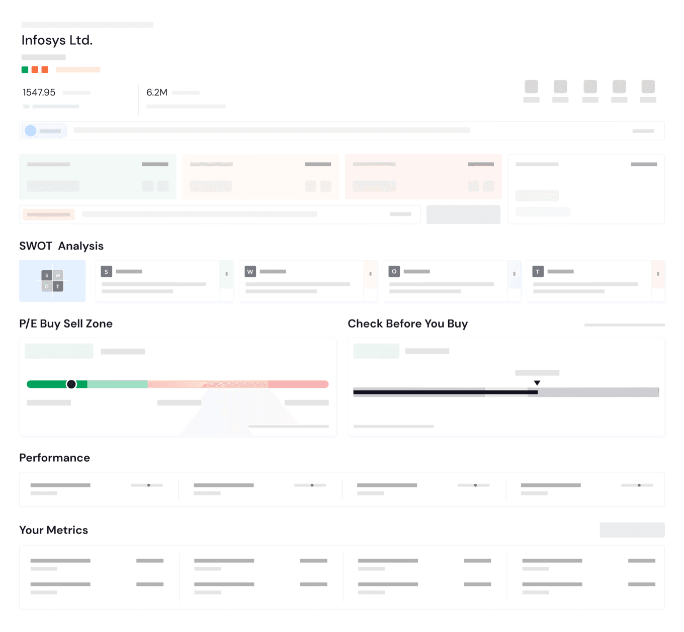
Tested at wireframe fidelity before engineering built anything
01 The price had to survive the scroll
I treated price as the one number everything else gets judged against, so it’s the only thing that stays fixed while the page moves.
02 Sequenced testing around the riskiest bet
Backend inference was the most expensive item in the build, so I put it in front of investors before it existed. Engineering committed on evidence, not conviction.
03 Bet on defaults over manual control
Manual reordering feature would’ve taken serious engineering effort. So I shipped the automated version first to see if it solved the same problem. If it didn’t, manual control was next in line.
The Delivery
Each piece below comes from something specific we found in Discovery or Validation.
Here’s what changed and why.
The new DVM & Forecaster
The old DVM leaned on heavy colour blocks that both personas found overwhelming at a glance, and Explorers still didn’t know what Durability or Momentum actually meant. Now colour only shows up as a thin bar at the top, and every box carries a plain-language tip, so users don’t need to already understand the metric to read it. These two functionalities enhance the educational aspect of this component. Meanwhile, the new Forecaster branding is subtle yet effective in differentiating it from the DVM style seen in earlier version.
New Buy Sell Zone & Checklist
80% of users couldn’t read the old butterfly chart, and the checklist, despite being one of the most useful things on the page, sat buried below everything else. Both are now a single segmented bar so position reads at a glance.
The Checklist is now prominently displayed on the chart, avoiding confusion with extraneous information. The top-left insight serves as a powerful tip, aiding users in decision-making for their investments.
Metrics
The old metrics strip crammed numbers together with no room to breathe, exactly what new users flagged as overwhelming. Each value gets its own space to read here, and the performance metrics shown are the same personalised set validated with users earlier.
The Results
Six weeks after launch, drop rate on the page fell from 32.1% to 8.4%, and daily active users rose from 68.2% to 82.6%. Both goals we’d set out with, wider adoption and stronger retention, moved in the same direction.
The personalised metrics strip ended up doing more work than anything else on the page. It’s also the one thing I’d push further next: let people adjust it themselves instead of only inferring it from their portfolio.
- Drop Rate
- 32.1% → 8.4%-74% relative reduction
- Daily Active Users
- 68.2% → 82.6%+14.4pt absolute increase
Thesis
Testing the riskiest idea first is what made the rest of this safe to ship.